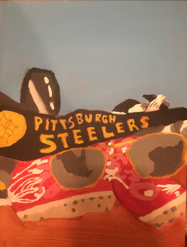
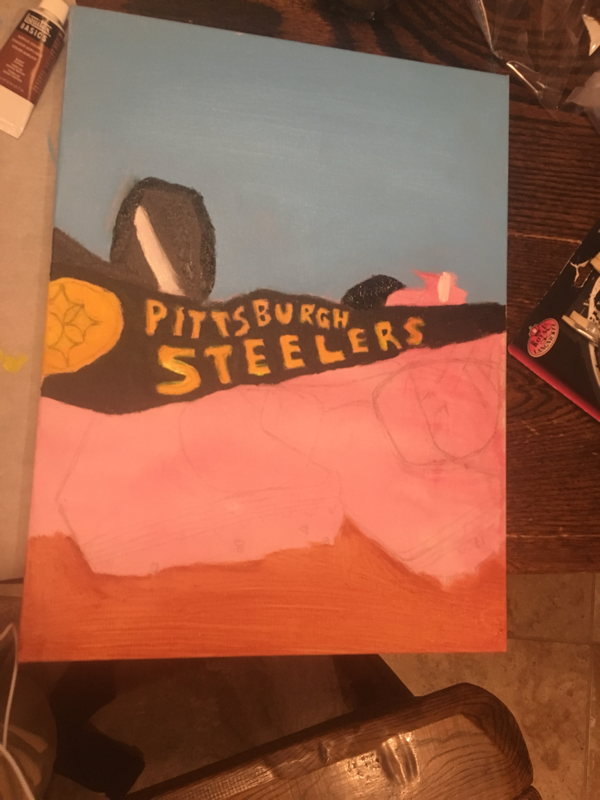
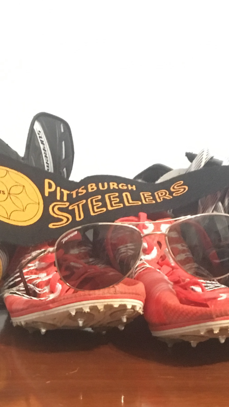
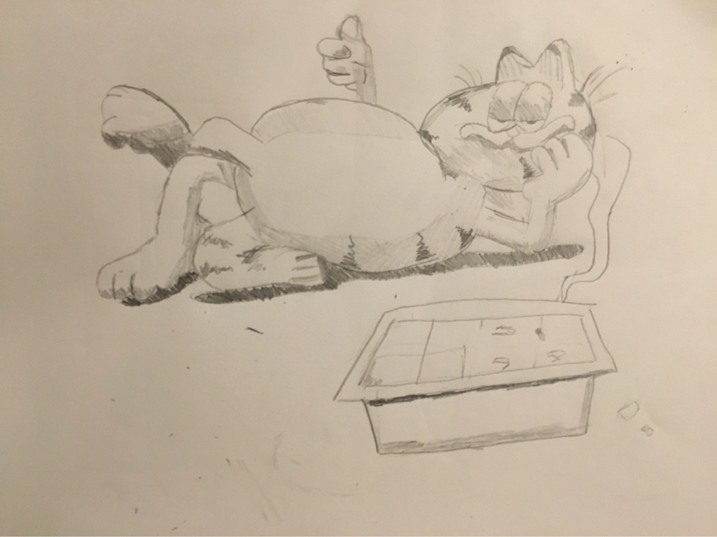
.the things that inspired me are my sunglasses, track spikes, Pittsburgh steelers banner, and my pair of skates. The spikes represent my love for running and the skates represent my overall love for all sports. The banner shows how the steelers are my favorite team and the shades just represent how chill I am. I find the design of the skates the best part of my piece and if I could change anything it would be the design of the shoes. I chose acrylic because it was easier to put exact design in. Also I think acrylic is easier to use when there are more designs on the painting.
|
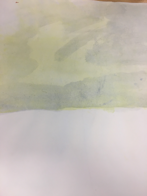
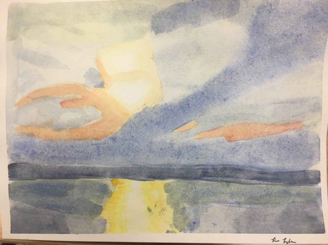
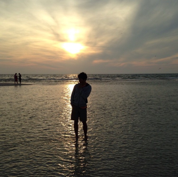
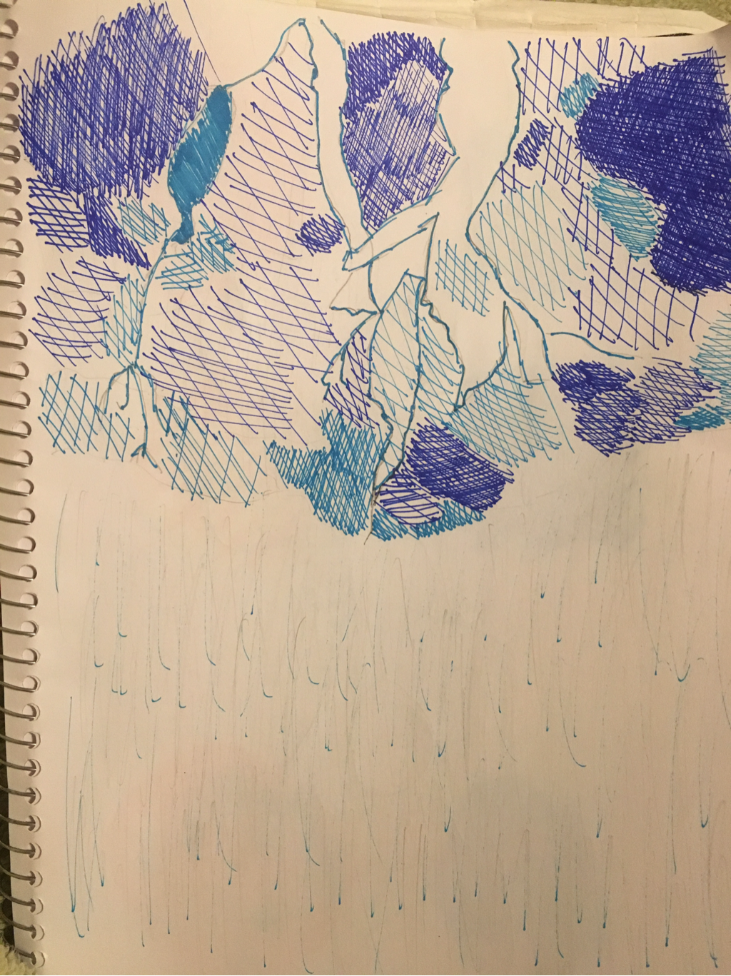
This place is important to me, because this was the Florida Keys. I absolutely love the beach so this was taken at a beach on the keys. I find most successful the contrast of the colors against each other. However, if I were to change anything I would like to blend the colors into each other better. The medium that was used was water color because the colors are so blended in the actual picture. This made me think to use water color since all the color blends so well together.
My partner was Sarah and she likes drawing as a whole. She got into drawing ever since she was a kid and continued to do it. As my partner, she is looking to make a good a pal. Her Weebly link is sarahd-apex-2017.weebly.com
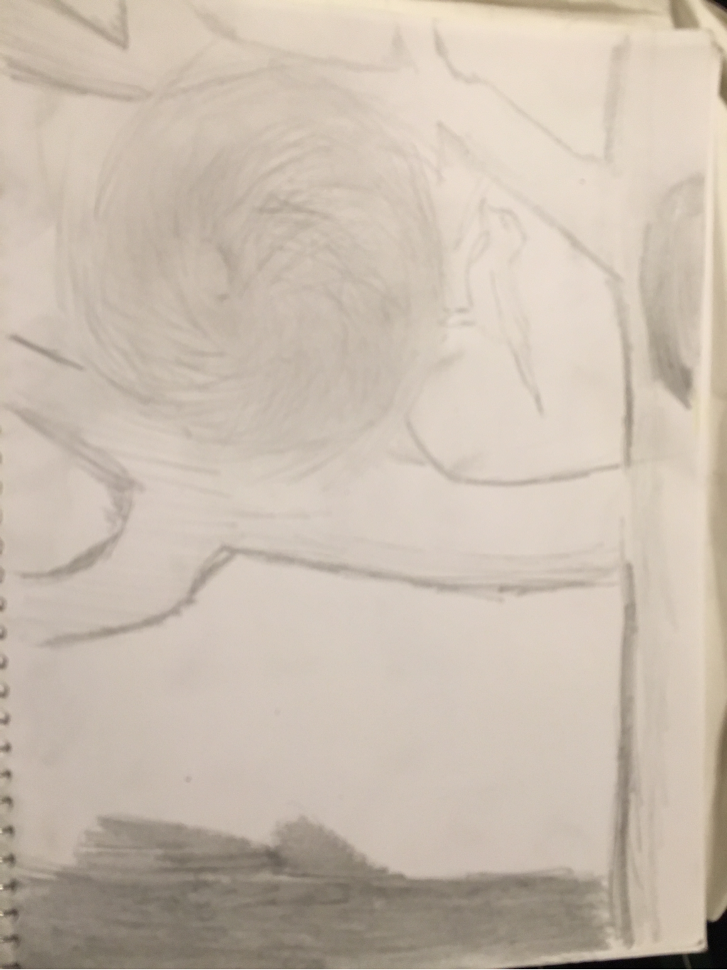
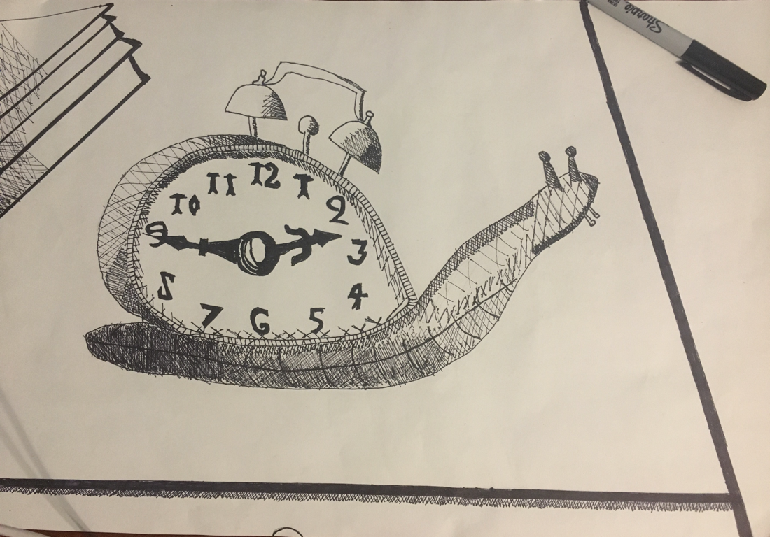
The two items that I combined were a snail and a clock. The reason why I morphed the two because sometimes time moves slow. I also thought of what else was round and could fit a clock. This thing was a snail and it happened to be slow so the drawing ultimately can mean time passes slowly or snails take a long time to move. For some reason I wanted to incorporate a clock because there was this one picture that influenced influenced me with the gears of a clock. Next, the first thing that came to my mind was a snail so I thought I'd morph them. I then wanted to add some detail and so I changed the time on the clock originally from 2:18 to 2:45. 2:45 shows what time practice starts for me and most days I look forward to practice that's why that time is significant.
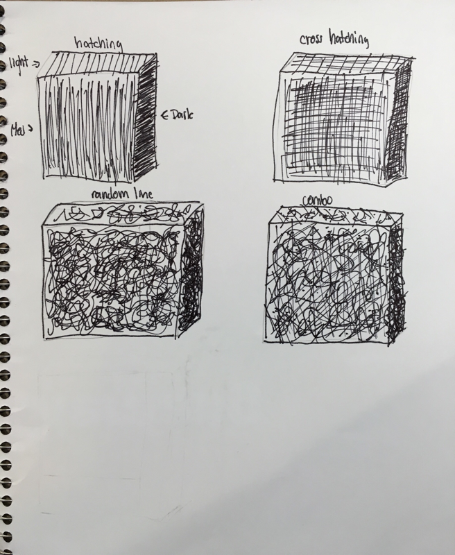
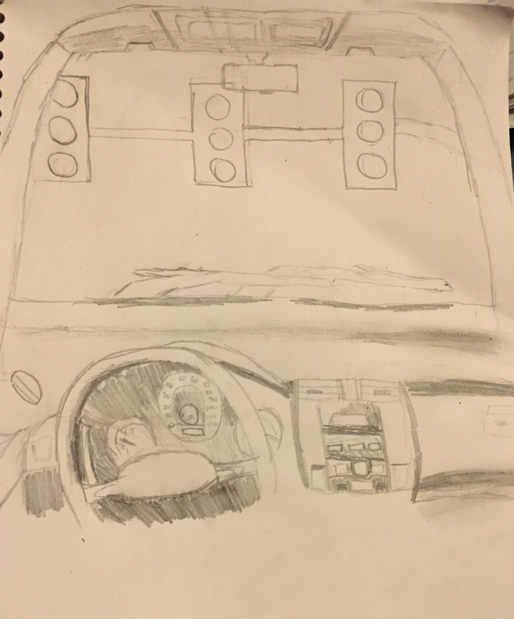
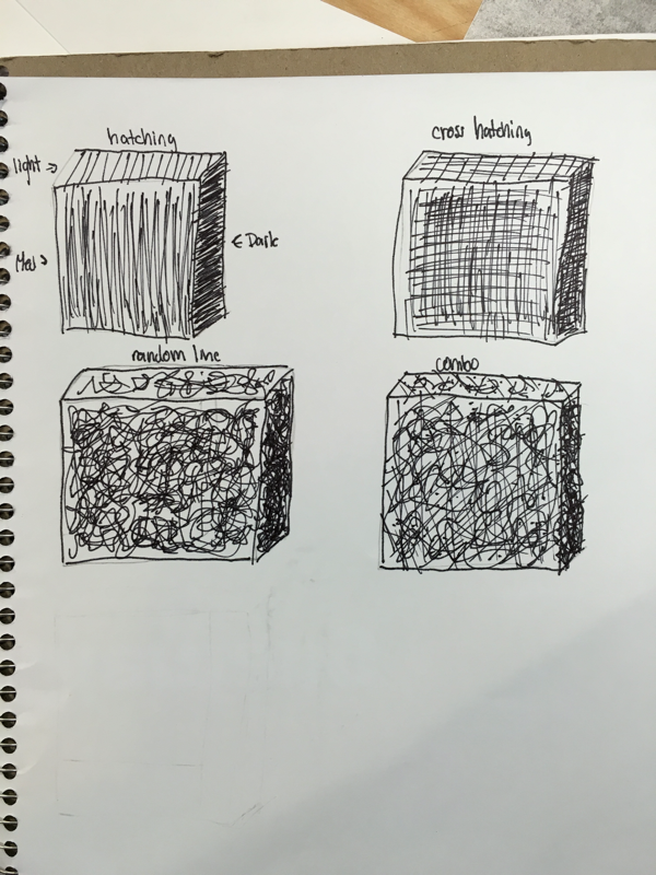
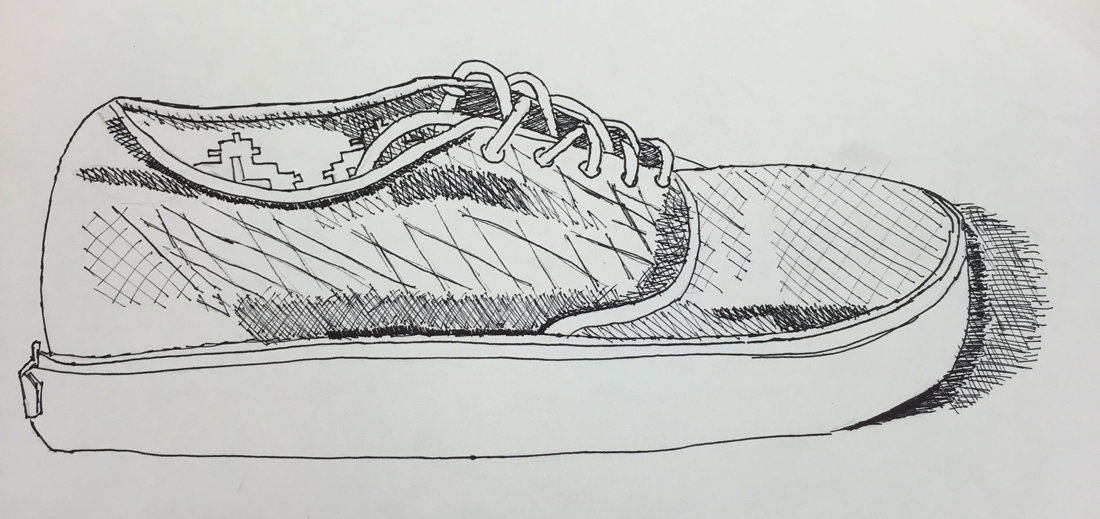
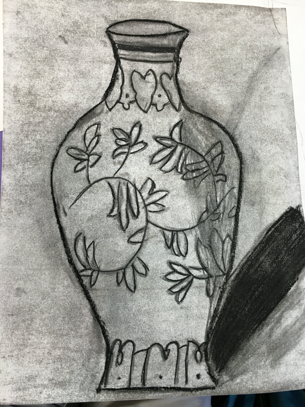
Personally, I feel the actual morphing of the two items was well done but the shading was not. All of the cross hatching looks very sloppy, because I was confused on how to do circles. If anything could be changed I'd say it would be how well the shading or value was done. Using the three mediums showed me how each has a unique finish. First, charcoal. In my opinion, charcoal was the hardest to use. The charcoal tended to smudge and when going ove some parts with light shading caused the outlines to disappear. However, charcoal was easy to erase and redraw anything. Charcoal could also come in any shade as long as there were layers. Next, pencil. Pencil felt the most natural of them all, but was still a little difficult. Although the lines were easy to erase then redraw, the overall look of pencil is not as dark. Finally, pen. Pen was my favorite to use due to how dark and permanent your lines were. The problems with pen are that if you make a mistake, you can't erase it. Also, it is hard to plan out the pen because if you write lightly it is still permanent. Benefits of pen are the darkness, and how much you have to think before you do. Since I had to plan everything out instead of just doing, I think the pen drawing turned out the best.
|
 RSS Feed
