
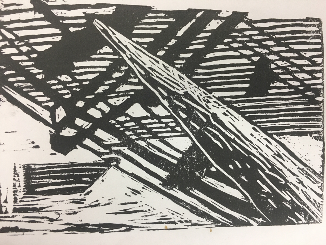
The best print is on the right and the worst is on the left. The process was fun to do and relatively easy. First I had to find a picture that inspired me then simply drew it in my book. I had to find out how to balance the black and white in the picture so I chose to line the sky. After you have drawn in your picture you cover the back in a graphite along the shape of the picture. Then you line the block of linoleum up with the graphite and push down so the design transfers through. Then you carve out either the black or white areas on the block giving you the different looks. Then you roll out ink and cover the surface of the block until it is completely black. Finally you place a piece of paper on top of the block to copy your design onto paper.
I incorporated the theme of "line" in my piece because my sky is an array of straight lines. Also through the piece you can tell it is just a bunch of straight lines instead of curves giving it an interesting texture.
I found the intricate design the most successful part of the piece. However, if I were to change anything it were to not make the lines so close in the background, because it can cause confusion. Sometimes it is hard to see the pole when there are so many lines in the background.
 RSS Feed
